VEERT
The creative process for VEERT focused on showcasing what sets the brand apart its timeless elegance, artistic direction, and sense of individuality.
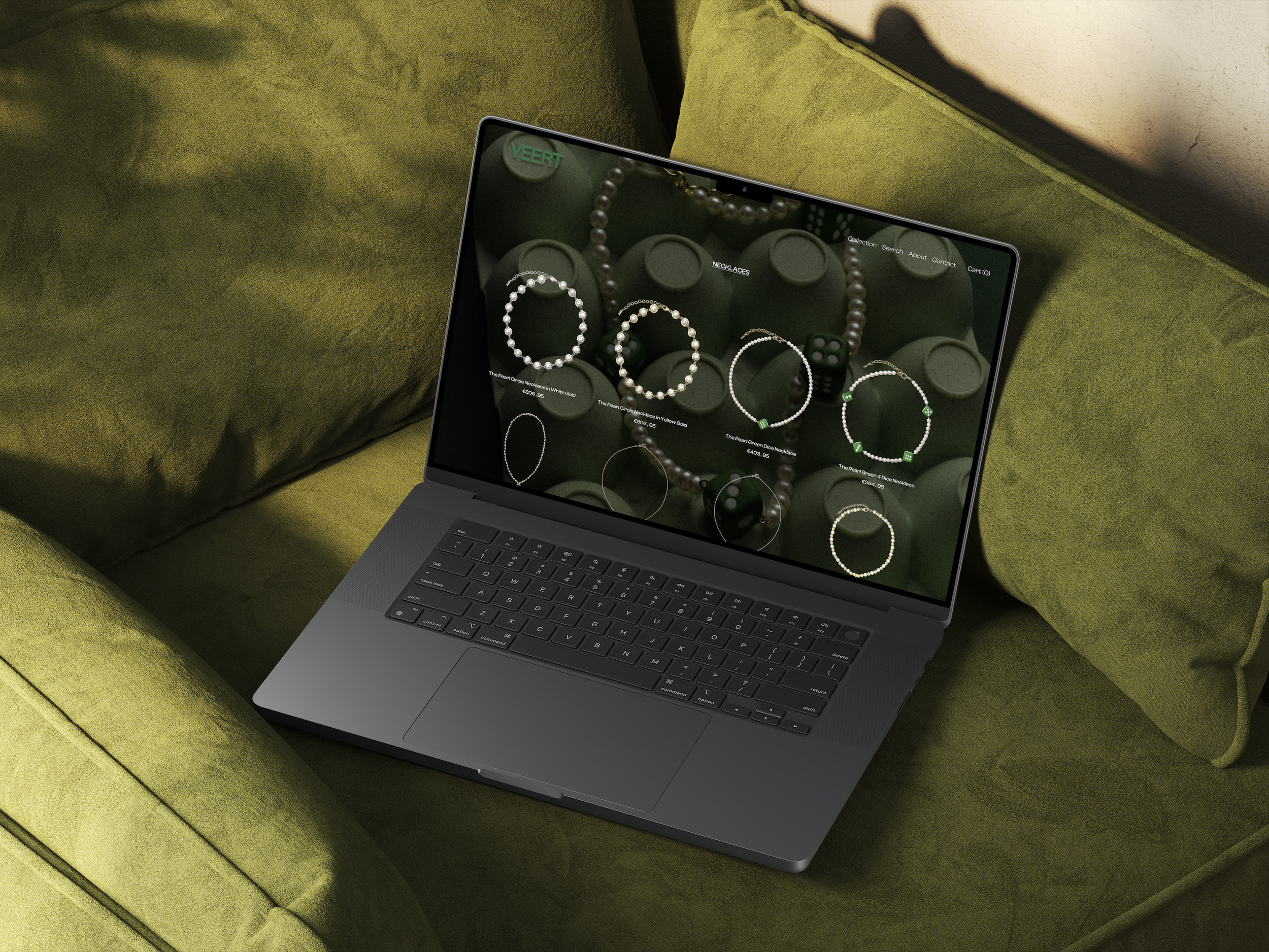
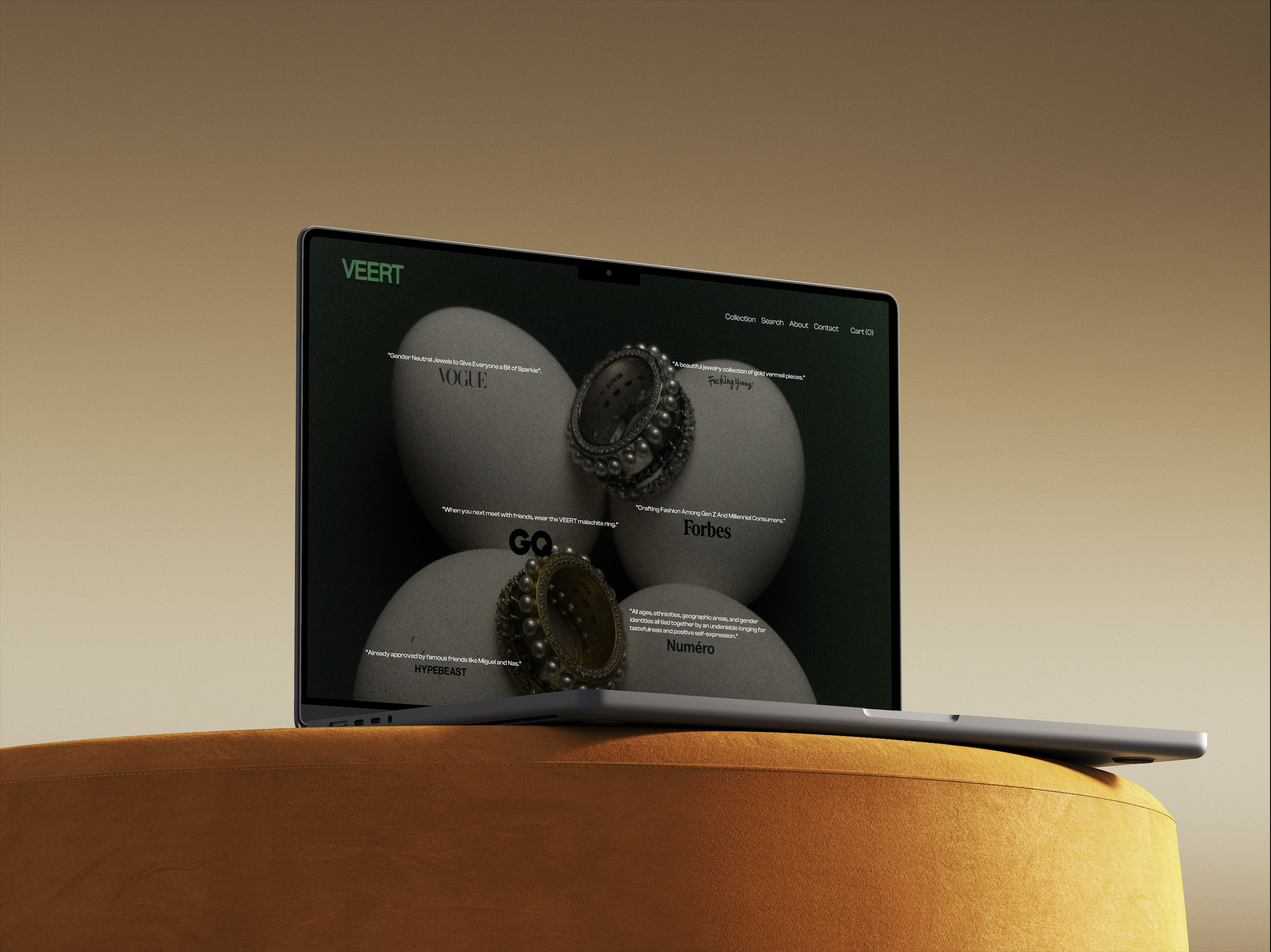
The design emphasizes sophistication through minimal layouts, deep tones, and immersive visuals that reflect VEERT’s signature aesthetic.
Every detail was crafted to elevate the user experience, encouraging visitors to explore, connect, and stay longer transforming visual attraction into emotional engagement and conversion.
Overview
Context:VEERT is a gender fluid luxury jewelry brand founded by Julia Lang. The goal: reimagine the digital experience without compromising the brand's identity.
Problem: The official website is functional and commerce first, but the brand's emotional universe symbolism, spirituality, materiality was underutilized digitally.
Creative Direction: Turn a transactional experience into an editorial one. Drawing from luxury campaigns, contemporary galleries, and cinema to craft a more immersive and atmospheric interface.
Key Decisions: Elegant serif typography, centered compositions, generous white space Ivory palette, deep greens, rich dark textures true to VEERT's DNA Fluid, intentional motion never intrusive Slowed user journey designed to build emotional attachment to the brand world
Outcome: A concept that repositions VEERT as a luxury cultural brand rather than a standard e-commerce platform proving that restraint, atmosphere, and storytelling can be more powerful than complexity.
Contexte: VEERT est une marque de joaillerie luxe gender fluid fondée par Julia Lang. L'objectif : repenser l'expérience digitale sans trahir l'identité de la marque.
Problème identifié: Le site officiel est fonctionnel et commerce first, mais l'univers émotionnel de la marque symbolisme, spiritualité, matières restait sous exploité digitalement.
Direction créative: Transformer une expérience transactionnelle en expérience éditoriale. S'inspirer des campagnes luxe, des galeries contemporaines et du cinéma pour créer une interface plus immersive et atmosphérique.
Décisions clés: Typographie serif élégante, compositions centrées, espaces généreux Palette ivoire, verts profonds, textures sombres fidèle à l'ADN VEERT Motion fluide et intentionnel, jamais intrusif Parcours utilisateur ralenti pour favoriser l'attachement émotionnel à la marque
Résultat: Un concept qui repositionne VEERT comme marque culturelle luxe plutôt que simple e-commerce en prouvant que retenue, atmosphère et storytelling peuvent être plus puissants que la complexité.